GemStone has two independent analysis systems. In the previous tutorials, you have worked with the Probability State Modeling (PSM) system to analyze the FCS files. Cen-se' is the second system, which can make use of PSM information to color and label cell type information.
Cen-se' is a fantastic tool for exploring your data. It statistically determines related events based on the measurements we select, and presents them in a bivariate plot. With Cen-se', we can assess how well our model is identifying cells in our cell types. We can also explore cells that do not yet belong to a cell type to find out what measurements identify them.
In this tutorial we extend the Project developed in the previous tutorials, Starting a New Project from Scratch, Adding Cell Types to the Project, and Analyzing Subsets. We add a Cen-se' plot to a report page and used to explore our data.
This tutorial continues to build the Project that was started in the following tutorials:
Develop: Starting a New Project from Scratch
Develop: Adding Cell Types to the Project
Start Gemstone by following the instructions in the Installation and Setup of GemStone section.
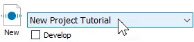
Open the "New Project Tutorial" Project that you created in the previous tutorials by selecting it in the Project dropdown list.
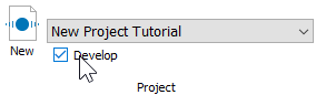
Click the Develop checkbox to enable develop mode.
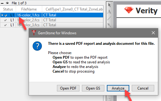
Double-click the first file in the batch list. A dialog of choices will be displayed.
Click Analyze to reanalyze the file with the latest model template revisions.
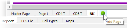
Click the Add Page button on the Report tab next to the NK cell type. This will create a new page for the report.
Right-click the new page and choose Rename.
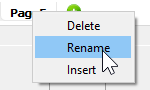
Edit the name to Cen-se and press Enter.
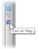
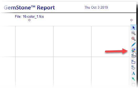
Select the Cen-se' tool on the report toolbar or from the Insert tab of the ribbon.
Click and drag to define space for a Cen-se' plot on the report page.
Double-click in the new Cen-se plot to display the Edit Graphics Options dialog.
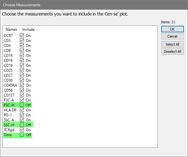
Click the Choose button for Measurements.
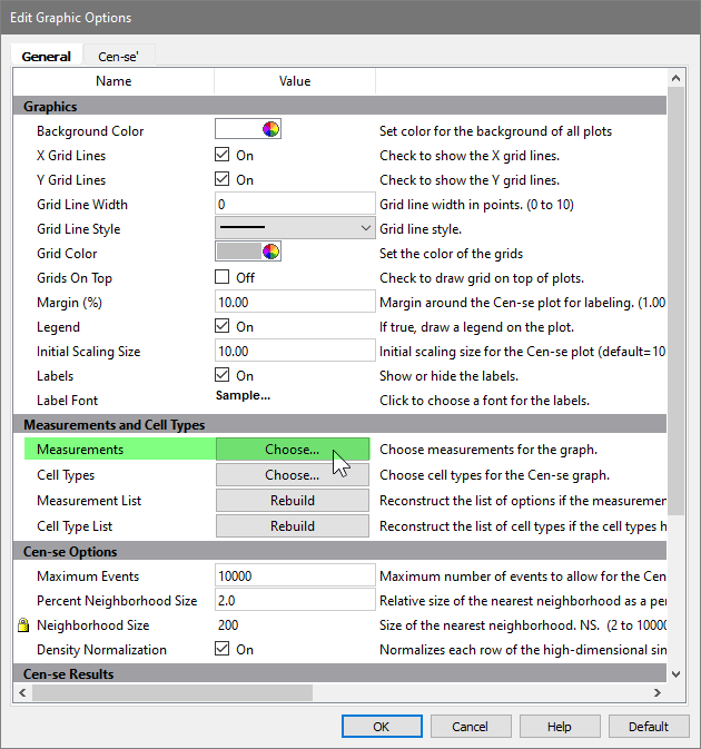
In the Choose Measurements dialog, enable all of the measurements except for FSC-H, SSC-H, and Time. We exclude these because FSC-A and SSC-A provide more information for the Cen-se, and Time does not help the Cen-se differentiate cell types.
Click OK.
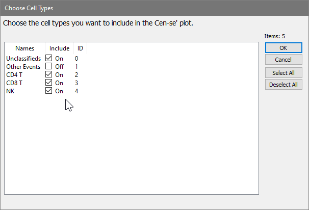
Click the Choose button for Cell Types.
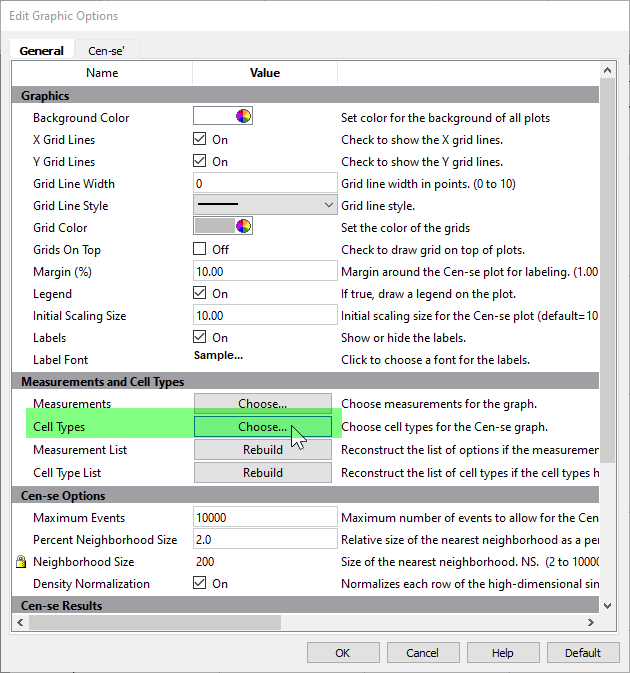
Make sure that all cell types are selected except for Other Events.
Click OK.
Click OK to close the Edit Graphic Options dialog.
Move the mouse over the Cen-se plot to show its toolbar, then click the Build Cen-se' tool.
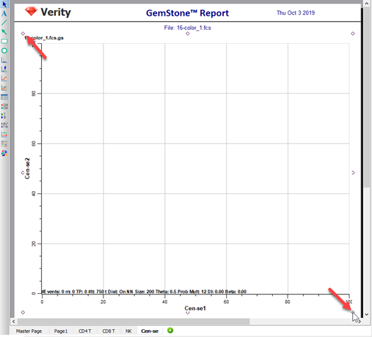
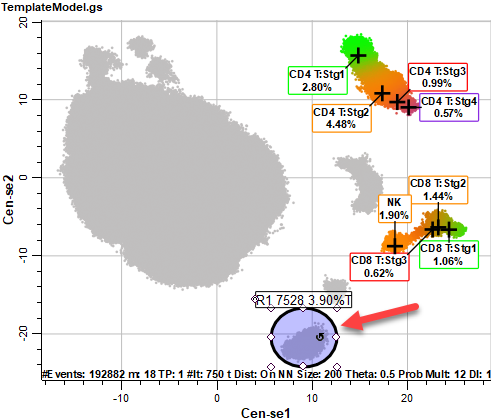
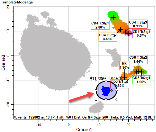
After a few moments, the Cen-se' plot will be displayed. The plot is a two-dimensional representation of the 21 measurements we selected in previous steps. Based on the popular t-SNE embedding algorithm (t-SNE © 2014 Laurens van der Maaten, Delft University of Technology), Cen-se' provides better separation of populations and computes much faster than t-SNE.
Notice that some of the populations are labeled with the cell type and stages created with the Cell Type wizard. This labeling is applied automatically for any of the cell types that we include in the Cen-se'. The coloring of the populations comes from the stage colors in this initial view of the plot. The gray dots represent populations that have not been defined in the template model yet.
Note, your graphics and statistics may differ from those shown below.
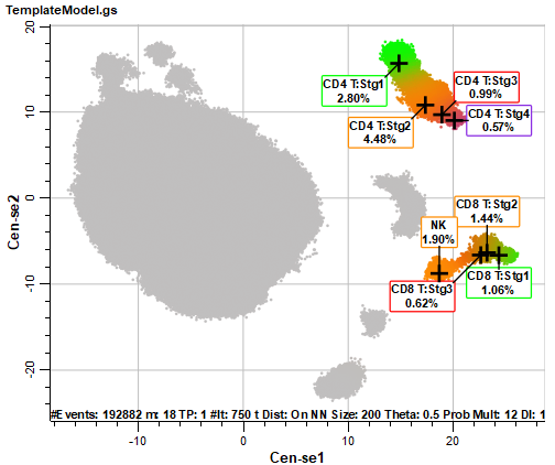
The CD4 T, CD8 T, and NK cell types are labeled, and the coloring from the cell types is applied to the events in the Cen-se' plot. There are also several populations of gray-colored events.
Double-click the plot to display the Edit Graphic Options dialog again. Move and size the dialog so that you can see the Cen-se' plot. Click the Cen-se' tab of the dialog.
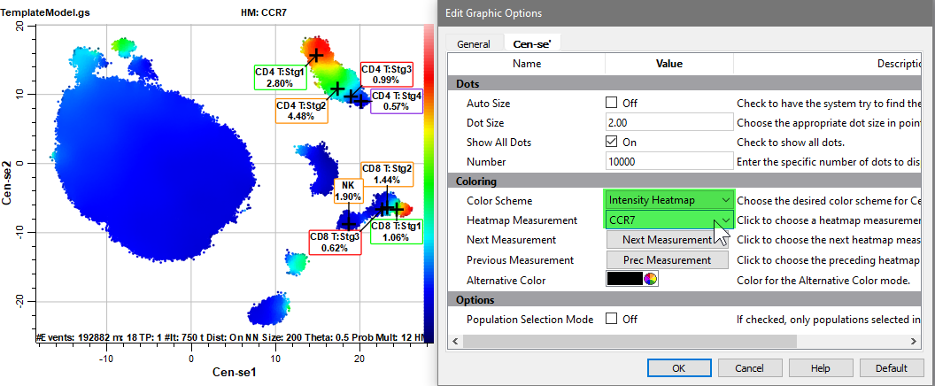
In the Coloring section, change Color Scheme to Intensity Heatmap.
Select CCR7 for the Heatmap Measurement. The Naive (Stg1) CD4 T and CD8 T cells are brightest for CCR7, as shown with red dots. Events that do not express CCR7 are shown as dark blue dots. The intensity color scale is shown on the right-hand side of the Cen-se' plot.
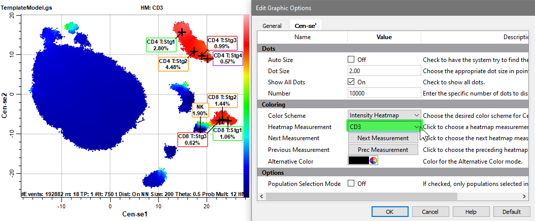
Change the Heatmap Measurement to CD3.
With CD3 selected, the CD4 T and CD8 T cell type show bright red dots.
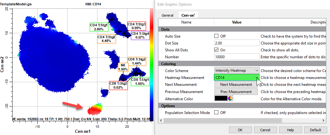
Select CD14 for the Heatmap Measurement.
One population is red, probably the monocytes.
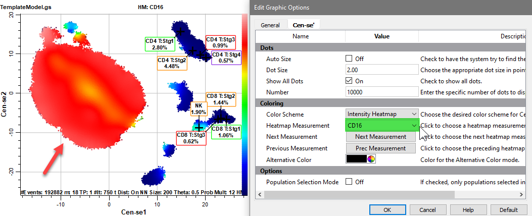
Select CD16 for the Heatmap Measurement.
The CD16 events are likely neutrophils, which would explain the large fraction of events in this population.
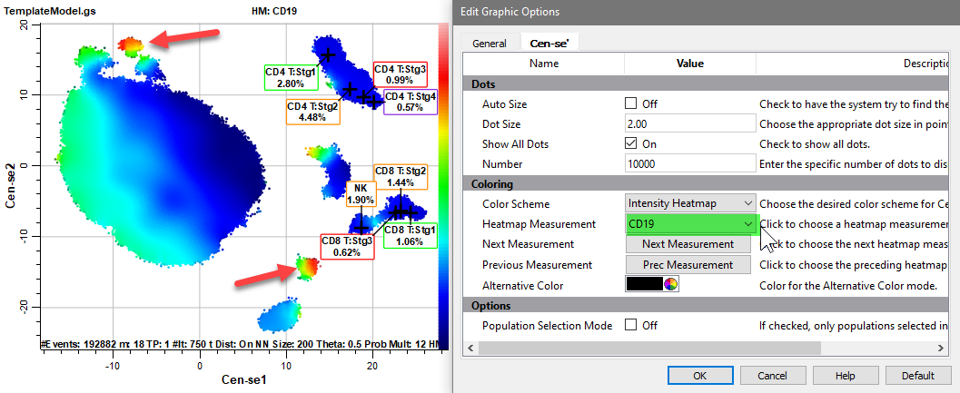
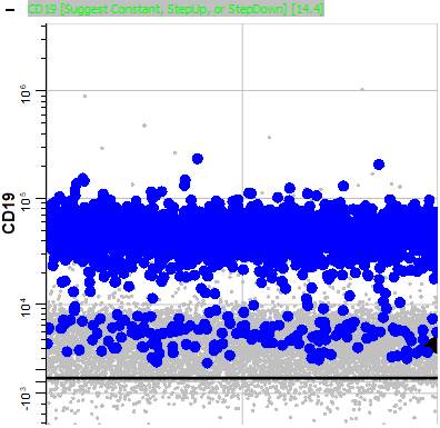
Select CD19 for the Heatmap Measurement.
One of the CD19 positive populations is probably B cells.
The Intensity Heatmap is a great way to explore and verify populations in the Cen-se plot.
Set Color Scheme back to Summary Map Colors, and click OK.
We have seen how colors and labels from the template model can enhance the Cen-se' plot. We can also use the Cen-se' plot to explore populations in the template model. This tight integration of Cen-se' and the Probability State Model is unique to GemStone and may be one of its most powerful features. Let's try it out.
Select the Ellipse Region tool in the Cen-se toolbar on the right side of the Cen-se plot.
Draw an elliptical region around the population we identified as CD14+.
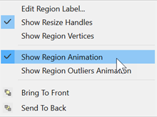
Right-click inside the region and choose Show Region Animation.
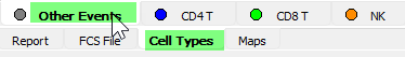
Click the Cell Types tab and select the Other Events cell type.
The Other Events cell type displays events that are not included in any of the other cell types defined in the model template.
You may need to scroll the cell type window so that you can see the upper left corner.
Right-click the first plot and choose Expand This Plot.
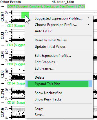
The dots that are blinking are the ones you surrounded on the Cen-se plot with the region. You can see that CCR7 is negative to dim for those events.
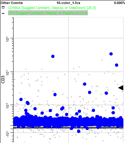
Use the Page Down key (PgDn) on the keyboard to view the next measurement, CD3. Most of the blinking events are negative for CD3.
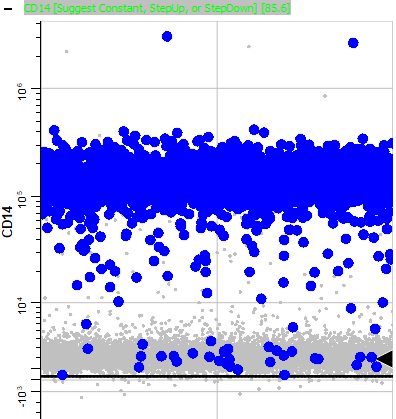
Page down until you find CD14. Note that most of the blinking events are positive for CD14.
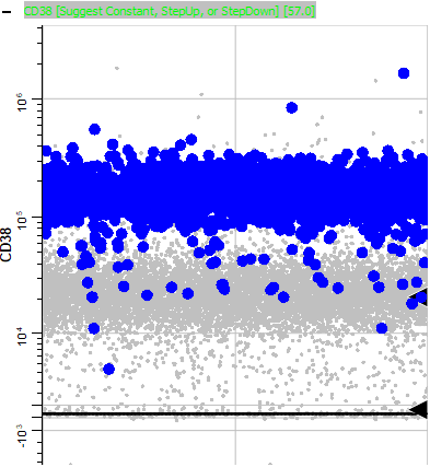
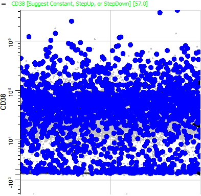
Page down until you come to CD38. Notice that it is also positive.
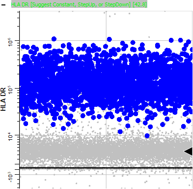
Page down to HLA DR. Note that this marker is positive for the animating events.
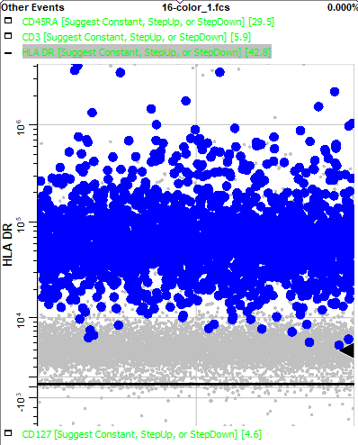
The phenotype of these blinking events, CD3- CD14+ CD38+ HLA DR+, points to this population being the monocytes. Using this information, you could use the Cell Type Wizard to create a new cell type for monocytes.
Return to the Cen-se' plot by selecting the Reports tab and choosing the Cen-se page.
Move the region to the smaller population near the monocytes. This was CD19+ in the Intensity Heatmap, so it may be the B cell population.
Return to the Other Events cell type by selecting the Cell Types tab and choosing Other Events.
Find CD38 and use the Expand This Plot command.
Note that all intensities of CD38 are blinking. Naive B cells express CD38, and CD38 is down-regulated as B cells mature.
Expand the CD19 expression profile.
Consistent with B cells, the bright CD19 events are blinking, along with some dim CD19 events.
Finally, expand the HLA DR plot and notice the bright HLA DR events are animating. This confirms that this is the B cell population.
Back on the Cen-se plot, right-click the R1 region and choose Show Region Animation again to toggle the animation off.
Using region animation, you can identify the key markers for unknown events that cluster together in Cen-se'. Often the markers will point to a known cell type that has not yet been created in the template model.
It is time to save the enhancements to our model template. Before saving, switch back to the Report tab, display the CD4 T report page, and scroll it to the position you want to appear when this template is used. The template will remember this view when it is saved.
Click Save in the Template section of the Develop tab on the ribbon.
In this tutorial, you create a Cen-se' plot on a report page. You selected the measurements and cell types that would be displayed in the Cen-se' and edited the graphic options.
The Intensity Heatmap display provided a tool for reviewing locations on the Cen-se' plot that expressed each of the markers, one at a time. It gave us clues about the phenotype of the events and where cell types were located on the Cen-se'.
You drew a region on the Cen-se' plot to animate events in clusters that were not identified by the model template. With the events animating, you reviewed the Other Events cell type to see which markers were positive and which were negative for the animating dots.
The next tutorial contains additional exercises to continue building this model.